使用时需要使用数据绑定的方式,如images = ,js中声明相应变量:images: [{src: "/common/heart-rate01.png"}, {src: "/common/heart-rate02.png"}]。
组件
通用
通用事件
- 事件绑定在组件上,当组件达到事件触发条件时,会执行 JS 中对应的事件回调函数,实现页面 UI 视图和页面 JS 逻辑层的交互;
- 事件回调函数中通过参数可以携带额外的信息,如组件上的数据对象 dataset,事件特有的回调参数。
相对于私有事件,大部分组件都可以绑定如下事件。
| 名称 | 参数 | 描述 |
|---|---|---|
| touchstart | TouchEvent | 手指刚触摸屏幕时触发该事件。 |
| touchmove | TouchEvent | 手指触摸屏幕后移动时触发该事件。 |
| touchcancel | TouchEvent | 手指触摸屏幕中动作被打断时触发该事件。 |
| touchend | TouchEvent | 手指触摸结束离开屏幕时触发该事件。 |
| click | - | 点击动作触发该事件。 |
| longpress | - | 长按动作触发该事件。 |
| swipe | SwipeEvent | 组件上快速滑动后触发。 |
事件对象
1、TouchEvent 类型说明:
| 属性 | 类型 | 说明 |
|---|---|---|
| touches | TouchList | 触摸事件时的属性集合,包含屏幕触摸点的信息数组。 |
| changedTouches | TouchList | 暂不支持。(触摸事件时的属性集合,包括产生变化的屏幕触摸点的信息数组。数据格式和touches一样。该属性表示有变化的触摸点,如从无变有,位置变化,从有变无。例如用户手指刚接触屏幕时,touches数组中有数据,但changedTouches无数据。) |
其中,TouchList 是 Touch 对象的集合。
2、Touch 类型说明
| 属性 | 类型 | 说明 |
|---|---|---|
| identifier | number | 触摸点的标识符。对于多点同时触摸则是 [0,1,2,3,...],分别表示第一个手指、第二个手指...。一次触摸动作(手指按下到手指离开的过程),在整个屏幕移动过程中,该标识符不变,可以用来判断是否是同一次触摸过程。 |
| clientX | number | 距离可见区域左边沿的 X 轴坐标,不包含任何滚动偏移。 |
| clientY | number | 距离可见区域上边沿的 Y 轴坐标,不包含任何滚动偏移以及状态栏和 titlebar 的高度。 |
| pageX | number | 距离可见区域左边沿的 X 轴坐标,包含任何滚动偏移。 |
| pageY | number | 距离可见区域上边沿的 Y 轴坐标,包含任何滚动偏移。(不包含状态栏和 titlebar 的高度)。 |
| offsetX | number | 距离事件触发对象左边沿 X 轴的距离。 |
| offsetY | number | 距离事件触发对象上边沿 Y 轴的距离。 |
属性 | 类型 | 说明 |
|---|---|---|
direction | string | 滑动方向,可能值有:
|
通用方法
通用方法,是所有组件都可以调用的方法。在组件使用id标记 id 属性后,开发者可通过this.$element('idName')获取 dom 节点,再调用通用方法。
this.$element
获取指定 id 的组件 dom 对象,如果没有指定 id,则返回根组件 dom 对象,假设有如下模板:
<div>
    <div id='xxx'></div>
</div>
this.$element('xxx') 获取 id 为 xxx 的 div 组件实例对象, this.$element() 获取模板中的根组件实例对象。
getBoundingClientRect(Object object)
返回元素的大小及其相对于视窗的位置,需要在页面的 onShow 生命周期之后调用。
参数 Object object
| 属性 | 类型 | 默认值 | 必填 | 描述 |
|---|---|---|---|---|
| success | function | 否 | 接口调用成功的回调函数 | |
| fail | function | 否 | 接口调用失败的回调函数 | |
| complete | function | 否 | 接口调用结束的回调函数(调用成功、失败都会执行) |
object.success 回调函数参数说明 Object rect
| 属性 | 类型 | 描述 |
|---|---|---|
| left | number | 元素的左边界坐标 |
| right | number | 元素的右边界坐标 |
| top | number | 元素的上边界坐标 |
| bottom | number | 元素的下边界坐标 |
| width | number | 元素的宽度 |
| height | number | 元素的高度 |
代码示例
<div>
    <div id="box" class="box-normal"></div>
</div>
export default {
    onShow(){
        this.$element('box').getBoundingClientRect({
            success: function (data) {
                const { top, bottom, left, right, width, height } = data;
                console.log(data);
            },
            fail: (errorData, errorCode) => {
                console.log(`错误原因:${JSON.stringify(errorData)}, 错误代码:${errorCode}`)
            },
            complete: function () {
                console.log('complete')
            }
        })
    }
}
通用属性
常规属性
常规属性指的是组件普遍支持的用来设置组件基本标识和外观显示特征的属性。
名称 | 类型 | 默认值 | 必填 | 描述 |
|---|---|---|---|---|
id | string | - | 否 | 组件的唯一标识。 |
style | string | - | 否 | 组件的样式声明。 |
class | string | - | 否 | 组件的样式类,用于引用样式表。 |
ref | string | - | 否 | 用来指定指向子元素的引用信息,该引用将注册到父组件的$refs 属性对象上。 |
渲染属性
组件普遍支持的用来设置组件是否渲染的属性。
名称 | 类型 | 默认值 | 描述 |
|---|---|---|---|
for | Array | - | 根据设置的数据列表,展开当前元素。 |
if | boolean | - | 根据设置的boolean值,添加或移除当前元素。 |
show | boolean | - | 根据设置的boolean值,显示或隐藏当前元素。 |
属性和样式不能混用,不能在属性字段中进行样式设置。
通用样式
组件普遍支持的可以在 style 或 css 中设置组件外观样式。
名称 | 类型 | 默认值 | 描述 |
|---|---|---|---|
width | <length> | <percentage>5+ | - | 设置组件自身的宽度。 对于容器组件未设置时使用组件自身内容需要的宽度。对于基础组件未设置时组件宽度默认为0。 |
height | <length> | <percentage>5+ | - | 设置组件自身的高度。 对于容器组件未设置时使用组件自身内容需要的高度。对于基础组件未设置时组件高度默认为0。 |
min-width | <length> | <percentage>5+ | 0 | 设置元素的最小宽度。 |
max-width | <length> | <percentage>5+ | 0 | 设置元素的最大宽度。默认无限制。 |
min-height | <length> | <percentage>5+ | 0 | 设置元素的最小高度。 |
max-height | <length> | <percentage>5+ | 0 | 设置元素的最大高度。默认无限制。 |
padding | <length> | 0 | 使用简写属性设置所有的内边距属性。 |
padding-[left|top|right|bottom] | <length> | 0 | 设置左、上、右、下内边距属性。 |
margin | <length> | <percentage>5+ | 0 | 使用简写属性设置所有的外边距属性,该属性可以有1到4个值。 |
margin-[left|top|right|bottom] | <length> | <percentage>5+ | 0 | 设置左、上、右、下外边距属性。 |
border-width | <length> | 0 | 使用简写属性设置元素的所有边框宽度。 |
border-color | <color> | black | 使用简写属性设置元素的所有边框颜色。 |
border-radius | <length> | - | border-radius属性是设置元素的外边框圆角半径。 |
background-color | <color> | - | 设置背景颜色。 |
opacity5+ | number | 1 | 元素的透明度,取值范围为0到1,1表示为不透明,0表示为完全透明。 |
display | string | flex | 确定一个元素所产生的框的类型,可选值为:
|
[left|top|right|bottom] | <length> | <percentage>6+ | - | left|top确定元素的偏移位置。
|
动画样式
组件普遍支持的可以在 style 或 css 中设置的动态的旋转、平移、缩放效果。
| 名称 | 类型 | 默认值 | 描述 |
|---|---|---|---|
| transform | string | - | 详见表 1。 |
| animation-name | string | - | 指定@keyframes,详见表 2。 |
| animation-delay | <time> | 0 | 定义动画播放的延迟时间。支持的单位为[s(秒) | ms(毫秒) ],默认单位为 ms,格式为:1000ms 或 1s。 |
| animation-duration | <time> | 0 | 定义一个动画周期。支持的单位为[s(秒) | ms(毫秒) ],默认单位为 ms,格式为:1000ms 或 1s。 轻量级智能穿戴上,动画周期最大值为 60s。 animation-duration 样式必须设置,否则时长为 0,则不会播放动画。 |
| animation-iteration-count | number | infinite | 1 定义动画播放的次数,默认播放一次,可通过设置为 infinite 无限次播放。 |
| animation-timing-function | string | linear | 描述动画执行的速度曲线,用于使动画更为平滑。 可选项有: linear:表示动画从头到尾的速度都是相同的。ease-in:表示动画以低速开始,cubic-bezier(0.42, 0.0, 1.0, 1.0)。ease-out:表示动画以低速结束,cubic-bezier(0.0, 0.0, 0.58, 1.0)。ease-in-out:表示动画以低速开始和结束,cubic-bezier(0.42, 0.0, 0.58, 1.0)。 |
| animation-fill-mode | string | none | 指定动画执行结束后的状态。可选项有: none:恢复初始状态。forwards:保持动画结束时的状态(在最后一个关键帧中定义)。 |
表1 transform操作说明
| 名称 | 类型 | 描述 |
|---|---|---|
| translateX | <length> | X轴方向平移动画属性。 |
| translateY | <length> | Y轴方向平移动画属性。 |
| rotate | <deg> | <rad> | 旋转动画属性。 |
表2 @keyframes属性说明
| 名称 | 类型 | 默认值 | 描述 |
|---|---|---|---|
| background-color | <color> | - | 动画执行后应用到组件上的背景颜色。 |
| opacity | number | 1 | 动画执行后应用到组件上的不透明度值,为介于0到1间的数值,默认为1。 |
| width | <length> | - | 动画执行后应用到组件上的宽度值。 |
| height | <length> | - | 动画执行后应用到组件上的高度值。 |
| transform | string | - | 定义应用在组件上的变换类型,见表1。 |
对于不支持起始值或终止值缺省的情况,可以通过from和to显示指定起始和结束。示例:
<!-- xxx.hml -->
<div class="container">
  <div class="rect">
  </div>
</div>
/* xxx.css */
.container {
  display: flex;
  justify-content: center;
  align-items: center;
  height: 454px;
  width: 454px;
}
.rect{
  width: 200px;
  height: 200px;
  background-color: #f76160;
  animation-name: Go;
  animation-duration: 3s;
  animation-iteration-count: infinite;
}
@keyframes Go
{
   from {
     background-color: #f76160;
   }
   to {
     background-color: #09ba07;
   }
}
容器组件
div
基础容器,用作页面结构的根节点或将内容进行分组。
子组件
支持。
属性
| 名称 | 类型 | 默认值 | 必填 | 描述 |
|---|---|---|---|---|
| id | string | - | 否 | 组件的唯一标识。 |
| style | string | - | 否 | 组件的样式声明。 |
| class | string | - | 否 | 组件的样式类,用于引用样式表。 |
| ref | string | - | 否 | 用来指定指向子元素的引用信息,该引用将注册到父组件的$refs 属性对象上。 |
事件
| 名称 | 参数 | 描述 |
|---|---|---|
| click | - | 点击动作触发该事件。 |
| longpress | - | 长按动作触发该事件。 |
| swipe | SwipeEvent | 组件上快速滑动后触发。 |
样式
除支持通用样式 ,还支持如下样式:
名称 | 类型 | 默认值 | 必填 | 描述 |
|---|---|---|---|---|
flex-direction | string | row | 否 | flex容器主轴方向。可选项有:
|
flex-wrap | string | nowrap | 否 | flex容器是单行还是多行显示,该值暂不支持动态修改。可选项有:
|
justify-content | string | flex-start | 否 | flex容器当前行的主轴对齐格式。可选项有:
|
align-items | string | stretch5+ flex-start1-4 | 否 | flex容器当前行的交叉轴对齐格式,可选值为:
|
display | string | flex | 否 | 确定该元素视图框的类型,该值暂不支持动态修改。可选值为:
|
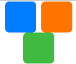
示例
- Flex 样式
<!-- xxx.html -->
<div class="container">
  <div class="flex-box">
    <div class="flex-item color-primary"></div>
    <div class="flex-item color-warning"></div>
    <div class="flex-item color-success"></div>
  </div>
</div>
/* xxx.css */
.container {
  flex-direction: column;
  justify-content: center;
  align-items: center;
  width: 454px;
  height: 454px;
}
.flex-box {
  justify-content: space-around;
  align-items: center;
  width: 400px;
  height: 140px;
  background-color: #ffffff;
}
.flex-item {
  width: 120px;
  height: 120px;
  border-radius: 16px;
}
.color-primary {
  background-color: #007dff;
}
.color-warning {
  background-color: #ff7500;
}
.color-success {
  background-color: #41ba41;
}

- Flex Wrap 样式
<!-- xxx.html -->

<div class="container">
  <div class="flex-box">
    <div class="flex-item color-primary"></div>
    <div class="flex-item color-warning"></div>
    <div class="flex-item color-success"></div>
  </div>
</div>
/* xxx.css */
.container {
  flex-direction: column;
  justify-content: center;
  align-items: center;
  width: 454px;
  height: 454px;
}
.flex-box {
  justify-content: space-around;
  align-items: center;
  flex-wrap: wrap;
  width: 300px;
  height: 250px;
  background-color: #ffffff;
}
.flex-item {
  width: 120px;
  height: 120px;
  border-radius: 16px;
}
.color-primary {
  background-color: #007dff;
}
.color-warning {
  background-color: #ff7500;
}
.color-success {
  background-color: #41ba41;
}
list
列表包含一系列相同宽度的列表项。适合连续、多行呈现同类数据,例如图片和文本。
子组件
仅支持<list-item>。
属性
| 名称 | 类型 | 默认值 | 必填 | 描述 |
|---|---|---|---|---|
| id | string | - | 否 | 组件的唯一标识。 |
| style | string | - | 否 | 组件的样式声明。 |
| class | string | - | 否 | 组件的样式类,用于引用样式表。 |
| ref | string | - | 否 | 用来指定指向子元素的引用信息,该引用将注册到父组件的$refs 属性对象上。 |
事件
| 名称 | 参数 | 描述 |
|---|---|---|
| click | - | 点击动作触发该事件。 |
| longpress | - | 长按动作触发该事件。 |
| swipe | SwipeEvent | 组件上快速滑动后触发。 |
| scroll | {scrollX:scrollXValue, scrollY:scrollYValue, scrollState:stateValue} | 列表滑动。stateValue 说明: 0:list 停止滑动。 1:list 正在通过用户的手势滑动。 2:list 正在滑动,用户已松手。 |
| scrollend | - | 列表滑动已经结束。 |
| scrollbottom | - | 当前列表已滑动到底部位置。 |
| scrolltop | - | 当前列表已滑动到顶部位置。 |
| scrolltouchup | - | 列表滑动过程中手指抬起。 |
方法
| 名称 | 参数 | 描述 |
|---|---|---|
| scrollTo | {index: number(指定位置)} | list 滑动到指定 index 的 item 位置。 |
| scrollBy | Object | 使 list 的内容滑动一定距离。 |
scrollBy 的参数说明:
| 名称 | 类型 | 是否必选 | 默认值 | 备注 |
|---|---|---|---|---|
| left | number | 否 | 0 | 从当前位置水平方向滑动距离,单位 px。值为正时向左滑动,为负时向右滑动。flex-direction 为 column 或 column-reverse 时不生效。 |
| top | number | 否 | 0 | 从当前位置垂直方向滑动距离,单位 px。值为正时向上滑动,为负时向下滑动。flex-direction 为 row 或 row-reverse 时不生效。 |
| behavior | smooth | instant | auto | 否 | auto | 是否平滑滑动,支持参数 smooth (平滑滚动),instant (瞬间滚动),默认值 auto,效果等同于 instant。 |
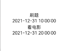
示例
<!-- index.html -->
<div class="container">
  <list class="todo-wraper">
    <list-item for="{{todolist}}" class="todo-item">
      <text class="todo-title">{{$item.title}}</text>
      <text class="todo-title">{{$item.date}}</text>
    </list-item>
  </list>
</div>
// index.js
export default {
  data: {
    todolist: [
      {
        title: "刷题",
        date: "2021-12-31 10:00:00",
      },
      {
        title: "看电影",
        date: "2021-12-31 20:00:00",
      },
    ],
  },
};
/* index.css */
.container {
  display: flex;
  justify-content: center;
  align-items: center;
  left: 0px;
  top: 0px;
  width: 454px;
  height: 454px;
}
.todo-wraper {
  width: 454px;
  height: 300px;
}
.todo-item {
  width: 454px;
  height: 80px;
  flex-direction: column;
}
.todo-title {
  width: 454px;
  height: 40px;
  text-align: center;
}
list-item
<list>的子组件,用来展示列表具体 item。
子组件
支持。
属性
| 名称 | 类型 | 默认值 | 必填 | 描述 |
|---|---|---|---|---|
| id | string | - | 否 | 组件的唯一标识。 |
| style | string | - | 否 | 组件的样式声明。 |
| class | string | - | 否 | 组件的样式类,用于引用样式表。 |
| ref | string | - | 否 | 用来指定指向子元素的引用信息,该引用将注册到父组件的$refs 属性对象上。 |
事件
| 名称 | 参数 | 描述 |
|---|---|---|
| click | - | 点击动作触发该事件。 |
| longpress | - | 长按动作触发该事件。 |
| swipe | SwipeEvent | 组件上快速滑动后触发。 |
样式
支持 通用样式
stack
堆叠容器,子组件按照顺序依次入栈,后一个子组件覆盖前一个子组件。
子组件
支持。
属性
| 名称 | 类型 | 默认值 | 必填 | 描述 |
|---|---|---|---|---|
| id | string | - | 否 | 组件的唯一标识。 |
| style | string | - | 否 | 组件的样式声明。 |
| class | string | - | 否 | 组件的样式类,用于引用样式表。 |
| ref | string | - | 否 | 用来指定指向子元素的引用信息,该引用将注册到父组件的$refs 属性对象上。 |
事件
| 名称 | 参数 | 描述 |
|---|---|---|
| click | - | 点击动作触发该事件。 |
| longpress | - | 长按动作触发该事件。 |
| swipe | SwipeEvent | 组件上快速滑动后触发。 |
样式
支持 通用样式
提示:
由于绝对定位不支持设置百分比,所以也不支持 stack 组件的子组件上设置 margin。
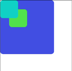
示例
<!-- xxx.html -->
<stack class="stack-parent">
  <div class="back-child bd-radius"></div>
  <div class="positioned-child bd-radius"></div>
  <div class="front-child bd-radius"></div>
</stack>
/* xxx.css */
.stack-parent {
  width: 400px;
  height: 400px;
  background-color: #ffffff;
  border-width: 1px;
  border-style: solid;
}
.back-child {
  width: 300px;
  height: 300px;
  background-color: #3f56ea;
}
.front-child {
  width: 100px;
  height: 100px;
  background-color: #00bfc9;
}
.positioned-child {
  width: 100px;
  height: 100px;
  left: 50px;
  top: 50px;
  background-color: #47cc47;
}
.bd-radius {
  border-radius: 16px;
}
swiper
堆叠容器,子组件按照顺序依次入栈,后一个子组件覆盖前一个子组件。
子组件
支持除<list>之外的子组件。
属性
| 名称 | 类型 | 默认值 | 必填 | 描述 |
|---|---|---|---|---|
| index | number | 0 | 否 | 当前在容器中显示的子组件的索引值。 |
| loop | boolean | true | 否 | 是否开启循环轮播。 不支持动态修改。 loop 参数生效需要满足以下两个条件: 除第一个子组件之外,剩余子组件的总长度大于等于 swiper 的长度;除最后一个子组件之外,剩余子组件的总长度大于等于 swiper 的长度。 |
| duration | number | - | 否 | 子组件切换的动画时长。 |
| vertical | boolean | false | 否 | 是否为纵向滑动,纵向滑动时采用纵向的指示器。 不支持动态修改。 |
| indicator | boolean | false | 否 | 是否启用导航点指示。 |
| enableswipe | boolean | true | 否 | 是否支持手势滑动swiper。 |
| id | string | - | 否 | 组件的唯一标识。 |
| style | string | - | 否 | 组件的样式声明。 |
| class | string | - | 否 | 组件的样式类,用于引用样式表。 |
| ref | string | - | 否 | 用来指定指向子元素的引用信息,该引用将注册到父组件的$refs 属性对象上。 |
事件
| 名称 | 参数 | 描述 |
|---|---|---|
| change | { index: currentIndex } | 当前显示的组件索引变化时触发该事件。 |
| click | - | 点击动作触发该事件。 |
| longpress | - | 长按动作触发该事件。 |
| swipe | SwipeEvent | 组件上快速滑动后触发。 |
方法
| 名称 | 参数 | 描述 |
|---|---|---|
| swipeTo | {index: number(指定位置)} | swiper 滚动到 index 位置 |
样式
除支持通用样式 ,还支持如下样式:
| 名称 | 类型 | 默认值 | 必填 | 描述 |
|---|---|---|---|---|
| indicator-color | <color> | rgba(0, 0, 0, 0.5) | 否 | indicator 填充颜色。 |
| indicator-selected-color | <color> | #33b4ff 或者 rgb(51, 180, 255) | 否 | indicator 选中时的颜色。 |
| indicator-size | <length> | 20px | 否 | indicator 组件的直径大小。 |
| indicator-[top|left|right|bottom] | <length> | <percentage> | - | 否 | indicator相对于swiper的位置。 |
示例
<!-- xxx.html -->
<swiper class="container" index="{{index}}">
  <div class="swiper-item primary-item">
    <text>1</text>
  </div>
  <div class="swiper-item warning-item">
    <text>2</text>
  </div>
  <div class="swiper-item success-item">
    <text>3</text>
  </div>
</swiper>
/* xxx.css */
.container {
  left: 0px;
  top: 0px;
  width: 454px;
  height: 454px;
}
.swiper-item {
  width: 454px;
  height: 454px;
  justify-content: center;
  align-items: center;
}
.primary-item {
  background-color: #007dff;
}
.warning-item {
  background-color: #ff7500;
}
.success-item {
  background-color: #41ba41;
}
/* xxx.js */
export default {
  data: {
    index: 1,
  },
};
基础组件
chart
子组件
不支持。
属性
| 名称 | 类型 | 默认值 | 必填 | 描述 |
|---|---|---|---|---|
| type | string | line | 否 | 设置图表类型(不支持动态修改),可选项有: bar:柱状图。line:线形图。 |
| options | ChartOptions | - | 是 | 图表参数设置,柱状图和线形图必须设置参数设置。可以设置 x 轴、y 轴的最小值、最大值、刻度数、是否显示,线条宽度、是否平滑等。(不支持动态修改) |
| datasets | Array<ChartDataset> | - | 是 | 数据集合,柱状图和线形图必须设置数据集合。可以设置多条数据集及其背景色。 |
| id | string | - | 否 | 组件的唯一标识。 |
| style | string | - | 否 | 组件的样式声明。 |
| class | string | - | 否 | 组件的样式类,用于引用样式表。 |
| ref | string | - | 否 | 用来指定指向子元素的引用信息,该引用将注册到父组件的$refs 属性对象上。 |
表 1 ChartOptions
| 名称 | 类型 | 默认值 | 必填 | 描述 |
|---|---|---|---|---|
| xAxis | ChartAxis | - | 是 | x 轴参数设置。可以设置 x 轴最小值、最大值、刻度数以及是否显示。 |
| yAxis | ChartAxis | - | 是 | y 轴参数设置。可以设置 y 轴最小值、最大值、刻度数以及是否显示。 |
| series | ChartSeries | - | 否 | 数据序列参数设置。可以设置 1)线的样式,如线宽、是否平滑;2)设置线最前端位置白点的样式和大小。 仅线形图支持。 |
表 2 ChartDataset
| 名称 | 类型 | 默认值 | 必填 | 描述 |
|---|---|---|---|---|
| backgroundColor(deprecated) | <color> | #ff6384 | 否 | 设置线或柱的颜色(不推荐使用)。 |
| strokeColor | <color> | #ff6384 | 否 | 线条颜色。 仅线形图支持。 |
| fillColor | <color> | #ff6384 | 否 | 填充颜色。线形图表示填充的渐变颜色。 |
| data | Array<number> | - | 是 | 设置绘制线或柱中的点集。 |
| gradient | boolean | false | 否 | 设置是否显示填充渐变颜色。 仅线形图支持。 |
表 3 ChartAxis
| 名称 | 类型 | 默认值 | 必填 | 描述 |
|---|---|---|---|---|
| min | number | 0 | 否 | 轴的最小值。 不支持负数。仅线形图支持。 |
| max | number | 100 | 否 | 轴的最大值。 不支持负数。仅线形图支持。 |
| axisTick | number | 10 | 否 | 轴显示的刻度数量。 仅支持 1~20,且具体显示的效果与如下计算值有关(图的宽度所占的像素/(max-min))。 因轻量级智能穿戴为整型运行,在除不尽的情况下会有误差产生,具体的表现形式是 x 轴末尾可能会空出一段。 在柱状图中,每组数据显示的柱子数量与刻度数量一致,且柱子显示在刻度处。 |
| display | boolean | false | 否 | 是否显示轴。 |
| color | <color> | #c0c0c0 | 否 | 轴颜色。 |
表 4 ChartSeries
| 名称 | 类型 | 默认值 | 必填 | 描述 |
|---|---|---|---|---|
| lineStyle | ChartLineStyle | - | 否 | 线样式设置,如线宽、是否平滑。 |
| headPoint | PointStyle | - | 否 | 线最前端位置白点的样式和大小。 |
| topPoint | PointStyle | - | 否 | 最高点的样式和大小。 |
| bottomPoint | PointStyle | - | 否 | 最低点的样式和大小。 |
| loop | ChartLoop | - | 否 | 设置屏幕显示满时,是否需要重头开始绘制。 |
表 5 ChartLineStyle
| 名称 | 类型 | 默认值 | 必填 | 描述 |
|---|---|---|---|---|
| width | <length> | 1px | 否 | 线宽设置。 |
| smooth | boolean | false | 否 | 是否平滑。 |
表 6 PointStyle
| 名称 | 类型 | 默认值 | 必填 | 描述 |
|---|---|---|---|---|
| shape | string | circle | 否 | 高亮点的形状。可选值为: circle:圆形。 |
| size | <length> | 5px | 否 | 高亮点的大小。 |
| strokeWidth | <length> | 1px | 否 | 边框宽度 |
| strokeColor | <color> | #ff0000 | 否 | 边框颜色。 |
| fillColor | <color> | #ff0000 | 否 | 填充颜色。 |
| display | boolean | true | 否 | 是否高亮显示。 |
表 7 ChartLoop
| 名称 | 类型 | 默认值 | 必填 | 描述 |
|---|---|---|---|---|
| margin | <length> | 1 | 否 | 擦除点的个数(最新绘制的点与最老的点之间的横向距离)。注意:轻量设备 margin 和 topPoint/bottomPoint/headPoint 同时使用时,有概率出现 point 正好位于擦除区域的情况,导致 point 不可见,因此不建议同时使用。 |
方法
| 方法 | 参数 | 描述 |
|---|---|---|
| append | { serial: number, // 设置要更新的线形图数据下标 data: Array<number>, // 设置新增的数据 } | 往已有的数据序列中动态添加数据,根据 serial 指定目标序列,serial 为 datasets 数组的下标,从 0 开始。注意:不会更新 datasets[index].data。仅线形图支持,按横坐标加 1 递增(与 xAxis min/max 设置相关)。 |
事件
| 名称 | 参数 | 描述 |
|---|---|---|
| click | - | 点击动作触发该事件。 |
| longpress | - | 长按动作触发该事件。 |
| swipe | SwipeEvent | 组件上快速滑动后触发。 |
样式
支持 通用样式
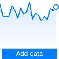
示例
- 线形图
<!-- xxx.html -->
<div class="container">
  <chart
    class="chart"
    type="line"
    ref="linechart"
    options="{{lineOps}}"
    datasets="{{lineData}}"
  ></chart>
  <input class="button" type="button" value="Add data" onclick="addData" />
</div>
/* xxx.css */
.container {
  flex-direction: column;
  justify-content: center;
  align-items: center;
  width: 454px;
  height: 454px;
  background-color: white;
}
.chart {
  width: 300px;
  height: 300px;
}
.button {
  width: 280px;
  border-radius: 0px;
}
// xxx.js
export default {
  data: {
    lineData: [
      {
        strokeColor: "#0081ff",
        fillColor: "#cce5ff",
        data: [
          763, 550, 551, 554, 731, 654, 525, 696, 595, 628, 791, 505, 613, 575,
          475, 553, 491, 680, 657, 716,
        ],
        gradient: true,
      },
    ],
    lineOps: {
      xAxis: {
        min: 0,
        max: 20,
        display: false,
      },
      yAxis: {
        min: 0,
        max: 1000,
        display: false,
      },
      series: {
        lineStyle: {
          width: "5px",
          smooth: true,
        },
        headPoint: {
          shape: "circle",
          size: 10,
          strokeWidth: 5,
          fillColor: "#ffffff",
          strokeColor: "#007aff",
          display: true,
        },
        loop: {
          margin: 2,
          gradient: true,
        },
      },
    },
  },
  addData() {
    this.$refs.linechart.append({
      serial: 0,
      data: [Math.floor(Math.random() * 400) + 400],
    });
  },
};
- 柱状图
<!-- xxx.html -->
<div class="container">
  <chart
    class="chart"
    type="bar"
    id="bar-chart"
    options="{{barOps}}"
    datasets="{{barData}}"
  ></chart>
</div>
/* xxx.css */
.container {
  flex-direction: column;
  justify-content: center;
  align-items: center;
  width: 454px;
  height: 454px;
  background-color: white;
}
.chart {
  width: 300px;
  height: 300px;
}
// xxx.js
export default {
  data: {
    barData: [
      {
        fillColor: "#f07826",
        data: [763, 550, 551, 554, 731, 654, 525, 696, 595, 628],
      },
      {
        fillColor: "#cce5ff",
        data: [535, 776, 615, 444, 694, 785, 677, 609, 562, 410],
      },
      {
        fillColor: "#ff88bb",
        data: [673, 500, 574, 483, 702, 583, 437, 506, 693, 657],
      },
    ],
    barOps: {
      xAxis: {
        min: 0,
        max: 20,
        display: false,
        axisTick: 10,
      },
      yAxis: {
        min: 0,
        max: 1000,
        display: false,
      },
    },
  },
};
image
子组件
不支持。
属性
| 名称 | 类型 | 默认值 | 必填 | 描述 |
|---|---|---|---|---|
| src | string | - | 否 | 图片的路径,支持的图片格式包括 png、jpg。 |
| id | string | - | 否 | 组件的唯一标识。 |
| style | string | - | 否 | 组件的样式声明。 |
| class | string | - | 否 | 组件的样式类,用于引用样式表。 |
| ref | string | - | 否 | 用来指定指向子元素的引用信息,该引用将注册到父组件的$refs 属性对象上。 |
提示:
轻量级智能穿戴上,单个应用所有的图片资源总大小不得超过 8M。
事件
| 名称 | 参数 | 描述 |
|---|---|---|
| click | - | 点击动作触发该事件。 |
| longpress | - | 长按动作触发该事件。 |
| swipe | SwipeEvent | 组件上快速滑动后触发。 |
| complete | {width: widthValue(px), height: heightValue(px)} | 图片加载完成时触发。 |
| error | - | 图片加载失败时触发。 |
样式
除支持通用样式 ,还支持如下样式:
名称 | 类型 | 默认值 | 必填 | 描述 |
|---|---|---|---|---|
object-fit | contain | cover | none | scale-down | - | cover | 图片的缩放类型。 contain:保持宽高比,缩小或者放大,使得图片完全显示在显示边界内,居中显示。 cover:保持宽高比,缩小或者放大,使得两边都大于或等于显示边界,居中显示。 none:居中,无缩放。 scale-down:保持宽高比,缩小或保持不变,取 contain 和 none中显示较小的一个,居中显示。 |
image-animator
图片帧动画播放器。
子组件
不支持。
属性
除支持通用属性 ,还支持如下属性:
名称 | 类型 | 默认值 | 必填 | 描述 |
|---|---|---|---|---|
images | Array<ImageFrame> | - | 是 | 设置图片帧信息集合。每一帧的帧信息包含图片路径、图片大小和图片位置信息。目前支持以下图片格式:png、jpg。ImageFrame的详细说明请见表1。 说明 |
iteration | number | string | infinite | 否 | 设置帧动画播放次数。number表示固定次数,infinite枚举表示无限次数播放。 |
reverse | boolean | false | 否 | 设置播放顺序。false表示从第1张图片播放到最后1张图片; true表示从最后1张图片播放到第1张图片。 |
fixedsize | boolean | true | 否 | 设置图片大小是否固定为组件大小。 true表示图片大小与组件大小一致,此时设置图片的width 、height 、top 和left属性是无效的。false表示每一张图片的 width 、height 、top和left属性都要单独设置。 |
duration | string | - | 是 | 设置单次播放时长。单位支持[s(秒)|ms(毫秒)],默认单位为ms。 duration为0时,不播放图片。 值改变只会在下一次循环开始时生效。 |
fillmode5+ | string | forwards | 否 | 指定帧动画执行结束后的状态。可选项有:
|
start | boolean | true | 否 | 指定是否执行帧动画。 |
表 1 ImageFrame 说明
| 名称 | 类型 | 默认值 | 必填 | 描述 |
|---|---|---|---|---|
| src | <uri> | - | 是 | 图片路径。 |
| width | <length> | 0 | 否 | 图片宽度。 |
| height | <length> | 0 | 否 | 图片高度。 |
| top | <length> | 0 | 否 | 图片相对于组件左上角的纵向坐标。 |
| left | <length> | 0 | 否 | 图片相对于组件左上角的横向坐标。 |
事件
| 名称 | 参数 | 描述 |
|---|---|---|
| stop | - | 帧动画结束时触发。 |
| click | - | 点击动作触发该事件。 |
| longpress | - | 长按动作触发该事件。 |
| swipe | SwipeEvent | 组件上快速滑动后触发。 |
样式
除支持通用样式 ,还支持如下样式:
名称 | 类型 | 默认值 | 必填 | 描述 |
|---|---|---|---|---|
images | Array<ImageFrame> | - | 是 | 设置图片帧信息集合。每一帧的帧信息包含图片路径、图片大小和图片位置信息。目前支持以下图片格式:png、jpg。ImageFrame的详细说明请见表1。 说明 使用时需要使用数据绑定的方式,如images = ,js中声明相应变量:images: [{src: "/common/heart-rate01.png"}, {src: "/common/heart-rate02.png"}]。 |
iteration | number | string | infinite | 否 | 设置帧动画播放次数。number表示固定次数,infinite枚举表示无限次数播放。 |
reverse | boolean | false | 否 | 设置播放顺序。false表示从第1张图片播放到最后1张图片; true表示从最后1张图片播放到第1张图片。 |
fixedsize | boolean | true | 否 | 设置图片大小是否固定为组件大小。 true表示图片大小与组件大小一致,此时设置图片的width 、height 、top 和left属性是无效的。false表示每一张图片的 width 、height 、top和left属性都要单独设置。 |
duration | string | - | 是 | 设置单次播放时长。单位支持[s(秒)|ms(毫秒)],默认单位为ms。 duration为0时,不播放图片。 值改变只会在下一次循环开始时生效。 |
fillmode5+ | string | forwards | 否 | 指定帧动画执行结束后的状态。可选项有:
|
方法
| 名称 | 参数 | 描述 |
|---|---|---|
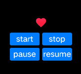
| start | - | 开始播放图片帧动画。再次调用,重新从第 1 帧开始播放。 |
| pause | - | 暂停播放图片帧动画。 |
| stop | - | 停止播放图片帧动画。 |
| resume | - | 继续播放图片帧。 |
| getState | - | 获取播放状态。可能值有: playing:播放中 paused:已暂停 stopped:已停止。 |
示例
<!-- xxx.html -->
<div class="container">
  <image-animator
    class="animator"
    ref="animator"
    images="{{frames}}"
    duration="1s"
  />
  <div class="btn-box">
    <input class="btn" type="button" value="start" @click="handleStart" />
    <input class="btn" type="button" value="stop" @click="handleStop" />
    <input class="btn" type="button" value="pause" @click="handlePause" />
    <input class="btn" type="button" value="resume" @click="handleResume" />
  </div>
</div>
/* xxx.css */
.container {
  flex-direction: column;
  justify-content: center;
  align-items: center;
  left: 0px;
  top: 0px;
  width: 454px;
  height: 454px;
}
.animator {
  width: 70px;
  height: 70px;
}
.btn-box {
  width: 264px;
  height: 120px;
  flex-wrap: wrap;
  justify-content: space-around;
  align-items: center;
}
.btn {
  border-radius: 8px;
  width: 120px;
  margin-top: 8px;
}
//xxx.js
export default {
  data: {
    frames: [
      {
        src: "/common/asserts/heart78.png",
      },
      {
        src: "/common/asserts/heart79.png",
      },
      {
        src: "/common/asserts/heart80.png",
      },
      {
        src: "/common/asserts/heart81.png",
      },
      {
        src: "/common/asserts/heart82.png",
      },
      {
        src: "/common/asserts/heart83.png",
      },
      {
        src: "/common/asserts/heart84.png",
      },
      {
        src: "/common/asserts/heart85.png",
      },
      {
        src: "/common/asserts/heart86.png",
      },
      {
        src: "/common/asserts/heart87.png",
      },
      {
        src: "/common/asserts/heart88.png",
      },
      {
        src: "/common/asserts/heart89.png",
      },
      {
        src: "/common/asserts/heart90.png",
      },
      {
        src: "/common/asserts/heart91.png",
      },
      {
        src: "/common/asserts/heart92.png",
      },
      {
        src: "/common/asserts/heart93.png",
      },
      {
        src: "/common/asserts/heart94.png",
      },
      {
        src: "/common/asserts/heart95.png",
      },
      {
        src: "/common/asserts/heart96.png",
      },
    ],
  },
  handleStart() {
    this.$refs.animator.start();
  },
  handlePause() {
    this.$refs.animator.pause();
  },
  handleResume() {
    this.$refs.animator.resume();
  },
  handleStop() {
    this.$refs.animator.stop();
  },
};
input
交互式组件,包括单选框,多选框,按钮。
子组件
不支持。
属性
| 名称 | 类型 | 默认值 | 必填 | 描述 |
|---|---|---|---|---|
| type | string | button | 否 | input 组件类型,可选值为 button,checkbox,radio。 button,checkbox,radio 不支持动态修改。可选值定义如下: button:定义可点击的按钮;checkbox:定义多选框;radio:定义单选按钮,允许在多个拥有相同 name 值的选项中选中其中一个; |
| checked | boolean | false | 否 | 当前组件是否选中,仅 type 为 checkbox 和 radio 生效。 |
| name | string | - | 否 | input 组件的名称。 |
| value | string | - | 否 | input 组件的 value 值,当类型为 radio 时必填且相同 name 值的选项该值唯一。 |
| id | string | - | 否 | 组件的唯一标识。 |
| style | string | - | 否 | 组件的样式声明。 |
| class | string | - | 否 | 组件的样式类,用于引用样式表。 |
| ref | string | - | 否 | 用来指定指向子元素的引用信息,该引用将注册到父组件的$refs 属性对象上。 |
事件
除支持通用事件 ,还支持如下事件:
- 当 input 类型为 checkbox、radio 时,支持如下事件:
| 名称 | 参数 | 描述 |
|---|---|---|
| change | { checked:true | false } | checkbox 多选框或 radio 单选框的 checked 状态发生变化时触发该事件。 |
| click | - | 点击动作触发该事件。 |
| longpress | - | 长按动作触发该事件。 |
| swipe | SwipeEvent | 组件上快速滑动后触发。 |
- 当 input 类型为 button 时,支持如下事件:
| 名称 | 参数 | 描述 |
|---|---|---|
| click | - | 点击动作触发该事件。 |
| longpress | - | 长按动作触发该事件。 |
| swipe | SwipeEvent | 组件上快速滑动后触发。 |
样式
除支持通用样式 ,还支持如下样式:
名称 | 类型 | 默认值 | 必填 | 描述 |
|---|---|---|---|---|
color | <color> | #ffffff | 否 | 单行输入框或者按钮的文本颜色。 |
font-size | <length> | 30px | 否 | 单行输入框或者按钮的文本尺寸。目前仅支持30px和38px 两个字体大小。 |
marquee
跑马灯组件,用于展示一段单行滚动的文字。
子组件
不支持。
属性
| 名称 | 类型 | 默认值 | 必填 | 描述 |
|---|---|---|---|---|
| scrollamount | number | 6 | 否 | 跑马灯每次滚动时移动的最大长度。 |
| id | string | - | 否 | 组件的唯一标识。 |
| style | string | - | 否 | 组件的样式声明。 |
| class | string | - | 否 | 组件的样式类,用于引用样式表。 |
| ref | string | - | 否 | 用来指定指向子元素的引用信息,该引用将注册到父组件的$refs 属性对象上。 |
事件
| 名称 | 参数 | 描述 |
|---|---|---|
| click | - | 点击动作触发该事件。 |
| longpress | - | 长按动作触发该事件。 |
| swipe | SwipeEvent | 组件上快速滑动后触发。 |
样式
除支持通用样式 ,还支持如下样式:
名称 | 类型 | 默认值 | 必填 | 描述 |
|---|---|---|---|---|
color | <color> | #ffffff | 否 | 设置跑马灯中文字的文本颜色。 |
font-size | <length> | 30 | 否 | 设置跑马灯中文字的文本尺寸。目前仅支持30px和38px 两个字体大小。 |
font-family | string | HYQiHei-65S | 否 | 字体。目前仅支持HYQiHei-65S 字体。 |
picker-view
嵌入页面的滑动选择器。
子组件
不支持。
属性
除支持通用属性 ,还支持如下属性:
名称 | 类型 | 默认值 | 必填 | 描述 |
|---|---|---|---|---|
type | string | text | 否 | 设置滑动选择器的类型,该属性不支持动态修改,可选项有:
|
名称 | 类型 | 默认值 | 必填 | 描述 |
|---|---|---|---|---|
range | Array | - | 否 | 设置文本选择器的取值范围。 说明 使用时需要使用数据绑定的方式,如range = ,js中声明相应变量:data:["15", "20", "25"]。 |
selected | string | 0 | 否 | 设置文本选择器的默认选择值,该值需要为range的索引。 |
名称 | 类型 | 默认值 | 必填 | 描述 |
|---|---|---|---|---|
selected | string | 00:00 | 否 | 设置时间选择器的默认取值,格式为 HH:mm; |
方法
事件
type=text:
| 名称 | 参数 | 描述 |
|---|---|---|
| change | { newValue: newValue, newSelected: newSelected } | 文本选择器选定值后触发该事件。 |
type=time:
| 名称 | 参数 | 描述 |
|---|---|---|
| change | { hour: hour, minute: minute} | 时间选择器选定值后触发该事件。 |
样式
除支持通用样式 ,还支持如下样式:
名称 | 类型 | 默认值 | 必填 | 描述 |
|---|---|---|---|---|
color | <color> | #808080 | 否 | 候选项字体颜色。 |
font-size | <length> | 30px | 否 | 候选项字体尺寸,类型length,单位px。 |
selected-color | <color> | #ffffff | 否 | 选中项字体颜色。 |
selected-font-size | <length> | 38px | 否 | 选中项字体尺寸,类型length,单位px。 |
font-family | string | HYQiHei-65S | 否 | 选项字体类型。 字体。目前仅支持HYQiHei-65S 字体。 |
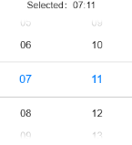
示例
<!-- xxx.html -->
<div class="container" @swipe="handleSwipe">
  <text class="title"> Selected:{{time}} </text>
  <picker-view
    class="time-picker"
    type="time"
    selected="{{defaultTime}}"
    @change="handleChange"
  ></picker-view>
</div>
/* xxx.css */
.container {
  flex-direction: column;
  justify-content: center;
  align-items: center;
  left: 0px;
  top: 0px;
  width: 454px;
  height: 454px;
}
.title {
  font-size: 30px;
  text-align: center;
}
.time-picker {
  width: 500px;
  height: 400px;
  margin-top: 20px;
}
/* xxx.js */
export default {
  data: {
    defaultTime: "",
    time: "",
  },
  onInit() {
    this.defaultTime = this.now();
  },
  handleChange(data) {
    this.time = this.concat(data.hour, data.minute);
  },
  now() {
    const date = new Date();
    const hours = date.getHours();
    const minutes = date.getMinutes();
    return this.concat(hours, minutes);
  },

  fill(value) {
    return (value > 9 ? "" : "0") + value;
  },

  concat(hours, minutes) {
    return `${this.fill(hours)}:${this.fill(minutes)}`;
  },
};
progress
进度条,用于显示内容加载或操作处理进度。
子组件
不支持。
属性
| 名称 | 类型 | 默认值 | 必填 | 描述 |
|---|---|---|---|---|
| type | string | horizontal | 否 | 设置进度条的类型,该属性不支持动态修改,可选值为: horizontal:线性进度条;arc:弧形进度条。 |
| id | string | - | 否 | 组件的唯一标识。 |
| style | string | - | 否 | 组件的样式声明。 |
| class | string | - | 否 | 组件的样式类,用于引用样式表。 |
| ref | string | - | 否 | 用来指定指向子元素的引用信息,该引用将注册到父组件的$refs 属性对象上。 |
不同类型的进度条还支持不同的属性:
类型为 horizontal 时,支持如下属性:
名称 类型 默认值 必填 描述 percent number 0 否 当前进度。取值范围为 0-100。 类型为 arc 时,支持如下属性:
名称 类型 默认值 必填 描述 percent number 0 否 当前进度。取值范围为 0-100。
事件
| 名称 | 参数 | 描述 |
|---|---|---|
| click | - | 点击动作触发该事件。 |
| longpress | - | 长按动作触发该事件。 |
| swipe | SwipeEvent | 组件上快速滑动后触发。 |
样式
除支持通用样式 ,还支持如下样式:
type=horizontal
名称 | 类型 | 默认值 | 必填 | 描述 |
|---|---|---|---|---|
color | <color> | #6b9ac7 | 否 | 设置进度条的颜色。 |
stroke-width | <length> | 32px | 否 | 设置进度条的宽度。 |
layer-color | <color> | #f0f0f0 或者 rgb(240, 240, 240) | 否 | 进度条的背景颜色。 |
| 名称 | 类型 | 默认值 | 必填 | 描述 |
|---|---|---|---|---|
| color | <color> | - | 否 | 弧形进度条的颜色。 |
| background-color | <color> | - | 否 | 弧形进度条的背景色。 |
| stroke-width | <length> | - | 否 | 弧形进度条的宽度。 进度条宽度越大,进度条越靠近圆心。即进度条始终在半径区域内。 |
| start-angle | <deg> | 240 | 否 | 弧形进度条起始角度,以时钟 0 点为基线。范围为 0 到 360(顺时针)。 |
| total-angle | <deg> | 240 | 否 | 弧形进度条总长度,范围为-360 到 360,负数标识起点到终点为逆时针。 |
| center-x | <length> | - | 否 | 弧形进度条中心位置,(坐标原点为组件左上角顶点)。该样式需要和 center-y 和 radius 一起。 |
| center-y | <length> | - | 否 | 弧形进度条中心位置,(坐标原点为组件左上角顶点)。该样式需要和 center-x 和 radius 一起。 |
| radius | <length> | - | 否 | 弧形进度条半径,该样式需要和 center-x 和 center-y 一起。 |
slider
滑动条组件,用来快速调节设置值,如音量、亮度等。
子组件
不支持。
属性
| 名称 | 类型 | 默认值 | 必填 | 描述 |
|---|---|---|---|---|
| min | number | 0 | 否 | 滑动选择器的最小值。 |
| max | number | 100 | 否 | 滑动选择器的最大值。 |
| step | number | 1 | 否 | - |
| value | number | 0 | 否 | 滑动选择器的初始值。 |
| id | string | - | 否 | 组件的唯一标识。 |
| style | string | - | 否 | 组件的样式声明。 |
| class | string | - | 否 | 组件的样式类,用于引用样式表。 |
| ref | string | - | 否 | 用来指定指向子元素的引用信息,该引用将注册到父组件的$refs 属性对象上。 |
事件
| 名称 | 参数 | 描述 |
|---|---|---|
| change | ChangeEvent | 选择值发生变化时触发该事件。 |
| click | - | 点击动作触发该事件。 |
| longpress | - | 长按动作触发该事件。 |
| swipe | SwipeEvent | 组件上快速滑动后触发。 |
表 1 ChangeEvent
| 属性 | 类型 | 说明 |
|---|---|---|
| progress | string | 当前 slider 的进度值。 |
| isFromUser | boolean | 该事件是否由于用户拖动触发。 |
样式
除支持通用样式 ,还支持如下样式:
名称 | 类型 | 默认值 | 必填 | 描述 |
|---|---|---|---|---|
color | <color> | #000000 | 否 | 滑动条的背景颜色。 |
selected-color | <color> | #ffffff | 否 | 滑动条的已选择颜色。 |
block-color | <color> | - | 否 | 滑块的颜色。 |
padding-[left|right] | <length> | 0 | 否 | 左右边距。 |
switch
开关选择器,通过开关,开启或关闭某个功能。
子组件
不支持。
属性
| 名称 | 类型 | 默认值 | 必填 | 描述 |
|---|---|---|---|---|
| checked | boolean | false | 否 | 是否选中。 |
| id | string | - | 否 | 组件的唯一标识。 |
| style | string | - | 否 | 组件的样式声明。 |
| class | string | - | 否 | 组件的样式类,用于引用样式表。 |
| ref | string | - | 否 | 用来指定指向子元素的引用信息,该引用将注册到父组件的$refs 属性对象上。 |
事件
| 名称 | 参数 | 描述 |
|---|---|---|
| change | { checked: checkedValue } | 选中状态改变时触发该事件。 |
| click | - | 点击动作触发该事件。 |
| longpress | - | 长按动作触发该事件。 |
| swipe | SwipeEvent | 组件上快速滑动后触发。 |
样式
支持 通用样式
| 名称 | 类型 | 默认值 | 必填 | 描述 |
|---|---|---|---|---|
| thumb-color | <color> | #ffffff 或者 rgb(255, 255, 255) | 否 | 滑块颜色 |
| track-color | <color> | #0d84ff 或者 rgb(13, 132, 255) | 否 | 滑轨颜色 |
qrcode
生成并显示二维码。
子组件
不支持。
属性
除支持通用属性外,还支持如下属性:
| 名称 | 类型 | 默认值 | 必填 | 描述 |
|---|---|---|---|---|
| value | string | - | 是 | 用来生成二维码的内容。 说明 最大长度为 256。 |
| type | string | rect | 否 | 二维码类型。可能选项有: rect:矩形二维码 circle:圆形二维码 |
样式
除支持通用样式外,还支持如下样式:
| 名称 | 类型 | 默认值 | 必填 | 描述 |
|---|---|---|---|---|
| color | <color> | #000000 | 否 | 二维码颜色 |
| background-color | <color> | #ffffff | 否 | 二维码背景颜色 |
提示:
- width 和 height 不一致时,以二者最小值作为二维码的边长。且最终生成的二维码居中显示;
- width 和 height 的最小值为 200px。
事件
支持通用事件。
示例
<qrcode value="https://www.70mai.com"></qrcode>
text
文本,用于呈现一段信息。
子组件
不支持。
属性
| 名称 | 类型 | 默认值 | 必填 | 描述 |
|---|---|---|---|---|
| id | string | - | 否 | 组件的唯一标识。 |
| style | string | - | 否 | 组件的样式声明。 |
| class | string | - | 否 | 组件的样式类,用于引用样式表。 |
| ref | string | - | 否 | 用来指定指向子元素的引用信息,该引用将注册到父组件的$refs 属性对象上。 |
方法
| 名称 | 参数 | 描述 |
|---|---|---|
| click | - | 点击动作触发该事件。 |
| longpress | - | 长按动作触发该事件。 |
| swipe | SwipeEvent | 组件上快速滑动后触发。 |
样式
除支持通用样式 ,还支持如下样式:
名称 | 类型 | 默认值 | 必填 | 描述 |
|---|---|---|---|---|
lines | <number> | -1 | 否 | 文本行数,-1 代表不限定行数。 |
color | <color> | #ffffff | 否 | 设置文本的颜色。 |
font-size | <length> | 30px | 否 | 设置文本的尺寸。 目前仅支持30px和38px 两个字体大小。 |
letter-spacing | <length> | 2px | 否 | 设置文本的字符间距。 |
text-align | string | left | 否 | 设置文本的文本对齐方式,可选值为:
|
line-height | <length> | - | 否 | 文本行高。 |
text-overflow | string | clip | 否 | 可选值为:
|
font-family | string | HYQiHei-65S | 否 | 字体。目前仅支持HYQiHei-65S 字体。 |